Behind the Cup Design
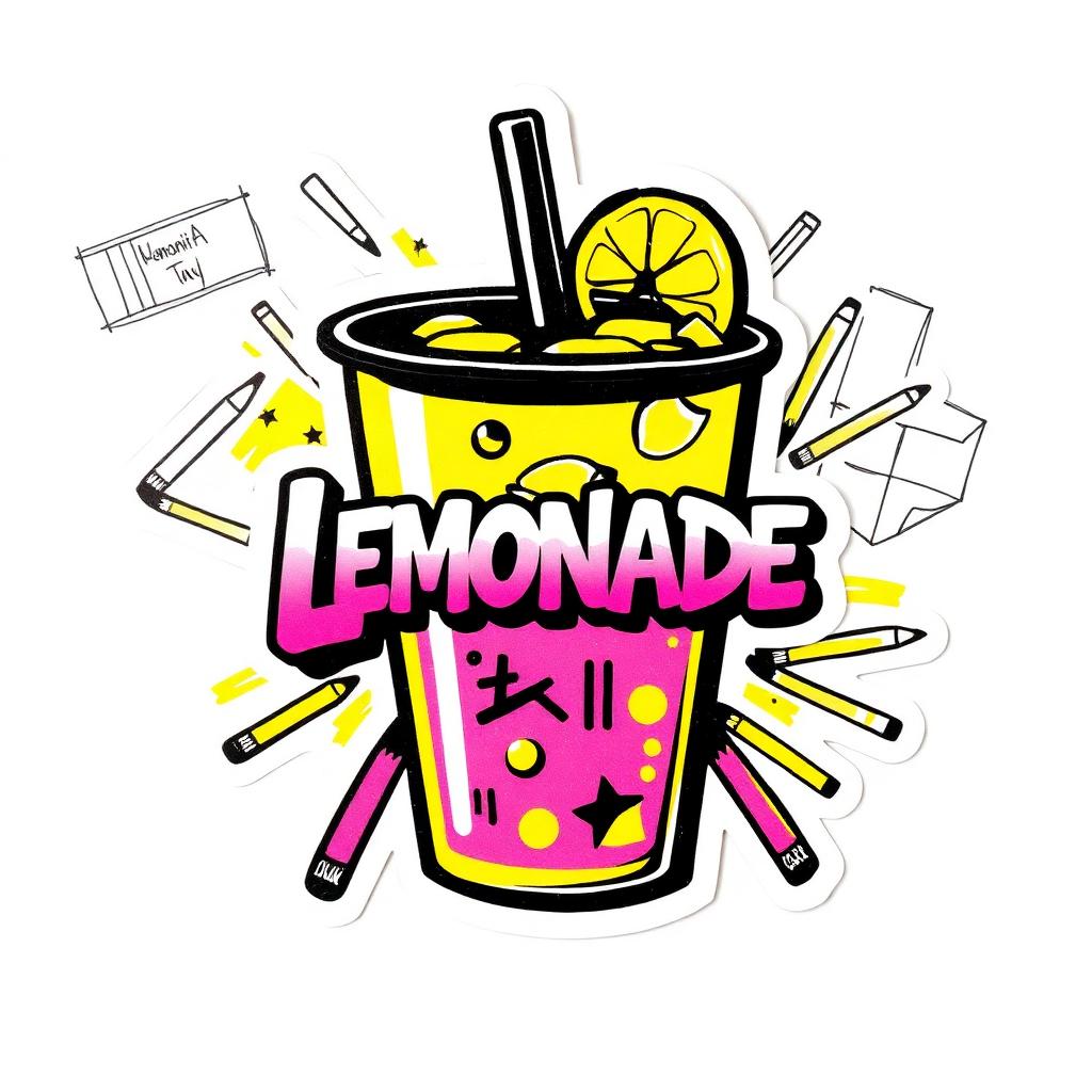
The cup is the silent ambassador of every drink. Most people, when they buy a lemonade, do not study the cup. They study the drink inside it. But the cup is the thing they hold for the next twenty minutes. The cup is what they put down on a picnic table. The cup is what shows up in the background of every photo. The cup, in other words, does more brand work than the logo on our chalkboard ever will.
So we obsess over our cups. We have redesigned them four times. Here is what each version got wrong, and what version five finally got right.
Version one was plain clear plastic with a sticker on the side. Mistake one: the sticker peeled off in condensation. By the third sip, half the customers were looking at a wrinkled, half-stuck logo. Mistake two: the plastic was thin and flimsy. The cup folded a little when you squeezed it, which made the lemonade feel cheap. Mistake three: there was no lid option, which meant no walking around with it.
Version two added a thicker walled cup and a printed logo instead of a sticker. The printing was beautiful but the cup was completely opaque white. Customers could not see the color of the lemonade. The pink lemonade looked identical to the classic lemonade. We had unknowingly hidden the most photogenic part of our product.
Version three went back to clear plastic, but this time with thicker walls and a single wraparound printed band near the bottom. Better. The lemonade was visible, the cup felt sturdy, and the logo did not peel. But the band was too thin, and from across a park or in a photo, you could not see our branding at all. The cup looked like any cup.
Version four added a big bold logo on the side, plus a graffiti splash, plus a small "Join The Squeeze" line under the rim. Way better. People started photographing the cup on purpose. We saw our cups on Instagram for the first time. But the cup was now too busy at the bottom and customers had a hard time reading the cup size info we had stamped there.
Version five — the version we sell today — is the one we are proud of. Thick clear plastic. A big bold side print with our logo and a graffiti splash. A clean band near the bottom with the size and a small "Join The Squeeze" line. A matching lid color for each cup size so the team can tell at a glance whether a customer ordered small, medium, or large. Compostable material. A sticker on the lid that says "thank you" in our handwriting.
The cup took two years of mistakes to get right. It was worth it. The cup is now one of our best marketing tools. People take it home. They photograph it. They reuse it. They show their friends. The cup is the souvenir of the stand.
The lesson is simple. Sweat the small object. The thing your customer holds in their hand is doing more work for your brand than any ad you will ever run.